Watches are, of course, mainly instruments to measure the passage of "time". However, "time" in that context is a man-made concept and is dependent on the machinations of atomic clocks and such-like. Furthermore, the division of the planet into time zones, although good for commerce and the punctuality of trains, has also helped to divorce us even further from the reality of the time by which humanity once lived i.e. solar time; for example - when it is noon at Greenwich (by "noon" I mean when the Sun is at it's highest, not 12 o/clock), the Sun over Rockall Island still has yet to climb quite a bit, even though it's in the same time zone. This also explains why using your watch to find North can send you wandering up to 15 degs off, and that's not including the 6 deg penalty for forgetting to correct for Summer Time (who, me?).
Anyway, the "equation of time" represents the imperfect motion of our planet around the Sun. The equation itself is horrendous, don't even bother to look at it. Generally, we tend to use the term to mean it's result for any given day of the year. Lindbergh used such a result on his epic flight to Paris. The equation of time is also of significance to garden gnomes, strangely enough. "What's the time, Grumpy?" - "Bloody 'ell have I got to climb up the sundial again??". You see, if you set a sundial to your watch on Feb 14th to please SWMBO, I guarantee it will be a half-hour fast when you next look at it on Nov 5 between fireworks.
So, without further ado, here are several ways from worst to best to represent this "equation of time" . . . ta daaa . . !!
The most seriously boring way is a table:
Part of a Sun Data table . . .
Col. 1: Date
Col. 2: Equation of Time. Number of minutes and seconds the Sun is off compared with an accurate clock which shows local mean time.
Col. 3: fast or slow (Sun).
Col. 4: Declination of the Sun in degrees and minutes. When negative, the Sun is south of the celestial equator; when positive, north. Values are averaged over the 4 year leap year cycle.
| Jan1 | 3.12 | S | -23.04 |
| Jan2 | 3.40 | S | -22.59 |
| Jan3 | 4.08 | S | -22.54 |
| Jan4 | 4.36 | S | -22.48 |
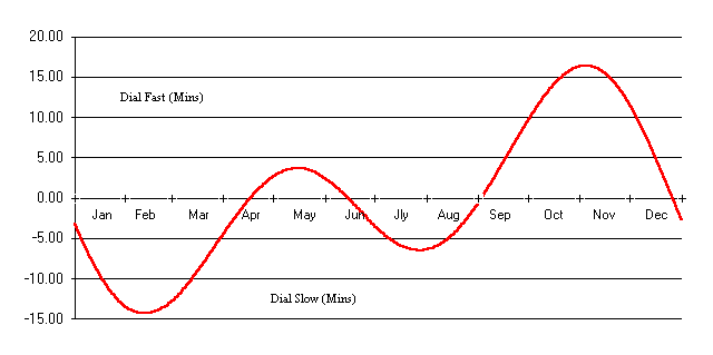
A little better - a graph
I prefer, at the very least, a visual approach. Here's the equation plotted out on bog-roll. You'll notice that clocks do agree with the Sun four times a year but it's not really obvious why in this graph form.

Better yet
If the graph is plotted against the angle of the Sun instead of against the time of year, the effect of our wobbly orbit, etc becomes immediately apparent.
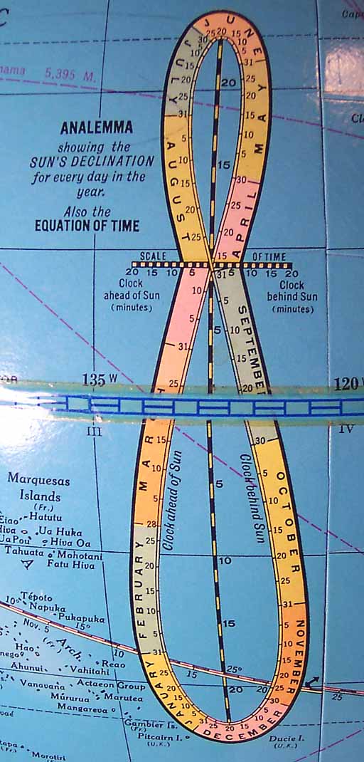
The figure below is called an "analemma" (no jokes, please).
and there's an even prettier one on our family globe, I didn't even know what it was until yesterday:

However it does look like the folks below knew all about it. It's a Jaeger-LeCoultre Gyrotourbillon (photo by Ron DeCorte, taken from Timezone.com). The cam rotates just once per year, as you should expect by now ;-) - if anyone knows what the months cam does, please leave a comment to this post.

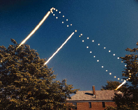
However I like this one the best. Straight from nature - a time-lapsed sequence of the Sun at 8:30 AM for a year, by Dennis di Cicco

Here's quite a good site on the subject analemma.com.

